This was going to be an article, but we have so much to say on the subject that we decided a column would be a better idea.
Welcome to Healthcare Graphics Need Help, a column where rather than spending our time criticizing the poor visuals often used in healthcare (and particularly the area of infection prevention & control!) we seek to give examples from the world that can make this sadly overlooked area of graphic design better.
For our first post, we’ll go back to something we said over a month ago on another blog – namely, that “…hand hygiene stations need to be as obvious and easy-to-use as fire extinguishers.” Here, for reference, is a fire extinguisher:

Photo by Tagg Design.
Beautiful, isn’t it? What could hand hygiene stations possibly learn from this?
1. Placement: This particular extinguisher is right beside our office kitchen. It is also at an accessible height – not too high or too low to be reached and can be both seen and used by random bystanders in case of a fire. You would be amazed how little attention placement gets in regards to hand hygiene – one of the few mandated locations that are currently even considered is “beside point-of-care”, but unlike fire extinguishers don’t often enough encourage use by random bystanders.
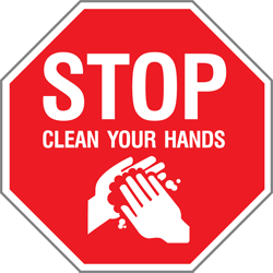
2. Colour: It’s red. Bright red. This is done to make the shape of the cylinder stand out – red has the highest emotional response of the colours and the recognizable shape shaves valuable time off of finding the extinguisher in an emergency. Hand hygiene stations don’t need to be entirely bright red – but in order to gain this recognition a visible enough part of them – like a sign – should be!
3. Education: It has a full set of operating instructions printed in large, bold, high-contrast type supported by illustrations for both quicker uptake and use by illiterate, non English-speaking or slightly visual-impaired people. Education by itself isn’t all that useful if it isn’t geared towards the general public (who doesn’t know this stuff yet!), or isn’t designed well enough to be read without squinting (or at all!), or is an inappropriate colour. A failure of any one of those could render an extinguisher useless! This isn’t merely about making it look nice, this is about making it all functional, from a design point of view.
Where is your nearest fire extinguisher? Once you’ve found that, where is your nearest hand rub? Point made!
[…] such as carefully-controlled signage, standardized safety symbols and a comprehensive public-facing campaign. On top of this, all these need to be in sync – such a protocol needs to ensure that […]