The original intent of this column was to showcase how graphic design could improve healthcare practices, without resorting to criticism. We’re not going to do that today.
It’s simply that without all the pieces of the puzzle it’s impossible to see the whole picture, which is why we’re breaking that rule. After all, we can make the claim that healthcare graphics need help but without examples you’d just have to take our word for it.
As the May 5th World Hand Hygiene awareness campaign (this year with the exciting topic of combating antibiotic resistance!) is getting under way, we felt that that would be a great topic for some criticism as there are many, many examples out there. This, folks, is how your various local and governmental organizations say “hand hygiene”:

This example by the Ontario Hospital Association is very typical in its design errors. It’s mistakes? The slogan lacks contrast with the light background, making it hard to read for those with limited visual acuity. The subtitle is almost invisible from close-up, never mind at a distance. Try squinting your eyes as a way to see this – the upper area almost disappears completely!
What is most confusing is the hand… symbol? Collection of… bacteria? What are those blobs? Why are they five different colours? Why does the visual not say “clean” in the slightest?

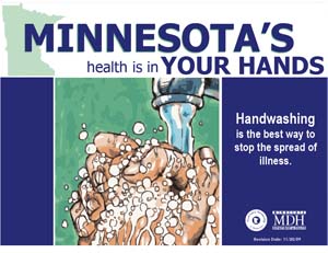
I hate to criticize the work of such a fine epidemiological organization as the US Centers for Disease Control, but here goes. CDC, this poster of yours is hard to read. The red is a good touch, and so is the white title, but otherwise the hand is too dark and those green splotches are too similar in shade to the blue – it “vibrates”, making the text hard to read.
There’s that hand again! I can see what they were trying to do: show how dirty your hands can get (or are, or will be… the poster isn’t clear!) and hope people make the logical leap and increase their efforts at keeping their hands disinfected. However, assuming that this is intended for healthcare workers (which is why I’m going easy on them using scientific names for the green germs!) wouldn’t an image of action (reinforcing their daily routine) get the point across better? Maybe show some hands washing names of bacteria off their hands perhaps? We don’t know, we’re not the CDC.
There IS that little symbol of hands rubbing (or clapping?) in the lower right, but good luck seeing that from across a room.

This is by the well-meaning people at Ontario Public Health. It’s their logo for their entire hand hygiene campaign. The simple design and sans-serif text is quite a good thing! Black and white? Easy to reproduce on any background or media imaginable! Overuse of the open palm symbol? Unfortunate.
Just humour us for a second and cover the bilingual text with your finger. You may as well do it for the other two examples, too. What does the image say to you when there’s no text to replace it? “High five”? “Stop where you are”? “I have a question”?
Is it waving? Clapping? That CDC one looks like a zombie reaching out for you. The one at the top seems to be a vaguely hand-shaped cluster of paint droplets floating in a puddle.
The take-away is that it doesn’t say hand hygiene. It just says “hand”. Without the “hygiene”, which we shouldn’t have to add is the reason for these designs.
Showing action in the graphic is one way of solving this problem. That way, those who don’t read English can just follow along with the picture and still get the point. So what? We’re a healthcare organization, are you trying to say that we employ people who can’t read? Not in the slightest. Even English speakers read faster when they’re reading pictures, and pictures with action say more in the same space. A picture is “worth a thousand words” after all.
So just make sure that your graphic shows some hand cleaning action, and you should be nearly there!
Or not. So maybe we have a few more of these columns to do before everyone’s ready to combat antibiotic resistance.
[…] especially if you aren’t steeped in it every day like we are. So difficult in fact that once again we’re using a communication from the venerable Centers for Disease […]