As a saying, the phrase “if looks could kill” is usually used in the rhetorical sense. Recently though there’s been some attention as to how this is, in fact, sometimes quite literally true.
Have you seen these?

If you haven’t, it might be hard to guess what they’re for. Candy, perhaps?
These are actually individual packets of dishwasher detergent, meant to dissolve (wrapper and all) and get your dishes sparkling clean. However, they don’t look like dishwasher detergent which usually comes in liquid or powder form. These come in little balls with bright colours and every once in a while a child will think they’re something sweet and pop them in their mouth.
This is usually followed by an Emergency department visit and/or a call to poison control.
Why does this happen? Human Factors. The design of something (in this case a cleaning product) should encourage proper use (washing dishes) and discourage improper use (such as eating it). People tend to assume and you want to make sure they assume the correct thing.
This laundry debacle isn’t the first or last time this has happened. Here is just one Europe-centric website detailing the problem posed by the accidental ingestion of non-food products in food-product-styled packaging.
The point is that design can have a great deal of effect on the behaviours of those who use it, both positive and negative.
What can we learn from this to benefit the prevention and control of infection?
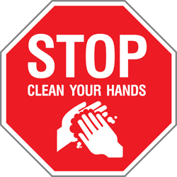
Firstly hand hygiene is crucial in every health setting. Dispensers and stations must actively invite correct use and do nothing to dissuade it. We’ve written about this quite a bit – in fact it was the very first HGNH post!
Secondly most infection control situations are invisible. They, like the lovely candy mentioned earlier, are innocuous to the uninformed but secretly deadly. Outbreak situations & everyday isolation practices are opaque to the average visitor, caregiver or volunteer. They are often downplayed in the effort to “reduce panic.” But is this effective? It certainly isn’t entirely truthful.
Let’s play devil’s advocate and examine what would likely happen if a hospital communicated outbreaks through pink and blue party balloons. People would assume (wrongly!) that the hospital was celebrating a birthday (Or worse, celebrating an outbreak!). Would this improve the control of infection? Of course it wouldn’t. People would not be driven to clean their hands to prevent themselves or their community getting sick if they think a birthday is the worst thing that could happen to them.
So why not be truthful?
There may be some minor panic, but would people make the wrong assumption about the situation? Quite the opposite: they’d take it more seriously, wash their hands more often, and may choose to stay away entirely. Infections don’t get spread. People become mindful of their community’s health.
And nobody mistakes an outbreak for a piece of candy.
[…] The main issue isn’t the science – that’s clear. It’s art, the art of promotion. Promotion gets staff performing hygiene regularly and even patients and visitors will do their part. Most methods of presenting hand hygiene in a hospital environment fall far short in this department. […]