“It’s not in the budget.”

1915_Burroughs_Adding_Machine_Ad_OM

“An ounce of prevention is worth a pound of cure.” -Benjamin Franklin

Despite the truth in the above adage, with a few exceptions (vaccines being one of the few) preventative measures are not prioritized in healthcare in favour of fast-acting cures.  This is true of mental health, cardiac health and particularly infection prevention, which ironically has the word in its very name. Read more ›

Posted in Articles

Healthcare Graphics Need Help: Mixed Messages

Visual communication is difficult, especially if you aren’t steeped in it every day like we are.  So difficult in fact that once again we’re using a communication from the venerable Centers for Disease Control:

CDC Poster

Today we’re talking about communicating through symbols and the importance of matching your visuals with your message – which this poster does not do.  Now, that’s not to say that the information in the poster is bad.  The content itself is good and very important to share if a bit wordy, but even the best campaigns can get derailed by poor visuals. Read more ›

Posted in Healthcare Graphics Need Help

Healthcare Graphics Need Help: Hand Hygiene’s Visibility Problem

If you follow our tweets or have been to our sites you’ve probably noticed that we tend to talk about hand hygiene a great deal.  It’s certainly the most common infection control intervention and it gets a great deal of attention as it is quite effective when performed consistently.  But that’s the rub – pun enthusiastically intended.  Consistency is an issue with any infection control measure.

The main issue isn’t the science – that’s clear.  It’s art, the art of promotion.  Promotion gets staff performing hygiene regularly and even patients and visitors will do their part.  Most methods of presenting hand hygiene in a hospital environment fall far short in this department.

Here’s what you typically see in hospitals:

il_TCH_02905_BLOG_graphics_C Read more ›

Posted in Healthcare Graphics Need Help

Healthcare Graphics Need Help: Order, Now!

As far as public health is concerned, effective communications reduce panic, promote life-saving interventions and above all create order.

However, as evidenced by the fact we have a whole column on our blog entitled “Healthcare Graphics Need Help,” it’s very, very easy to make mistakes when it comes time to actually put those above ideas into use.

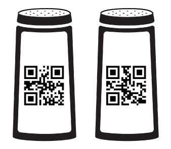
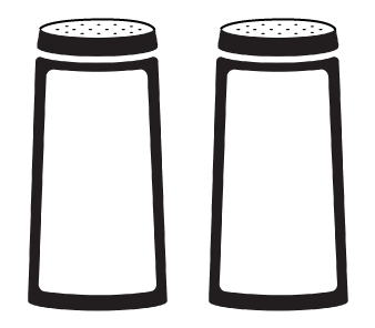
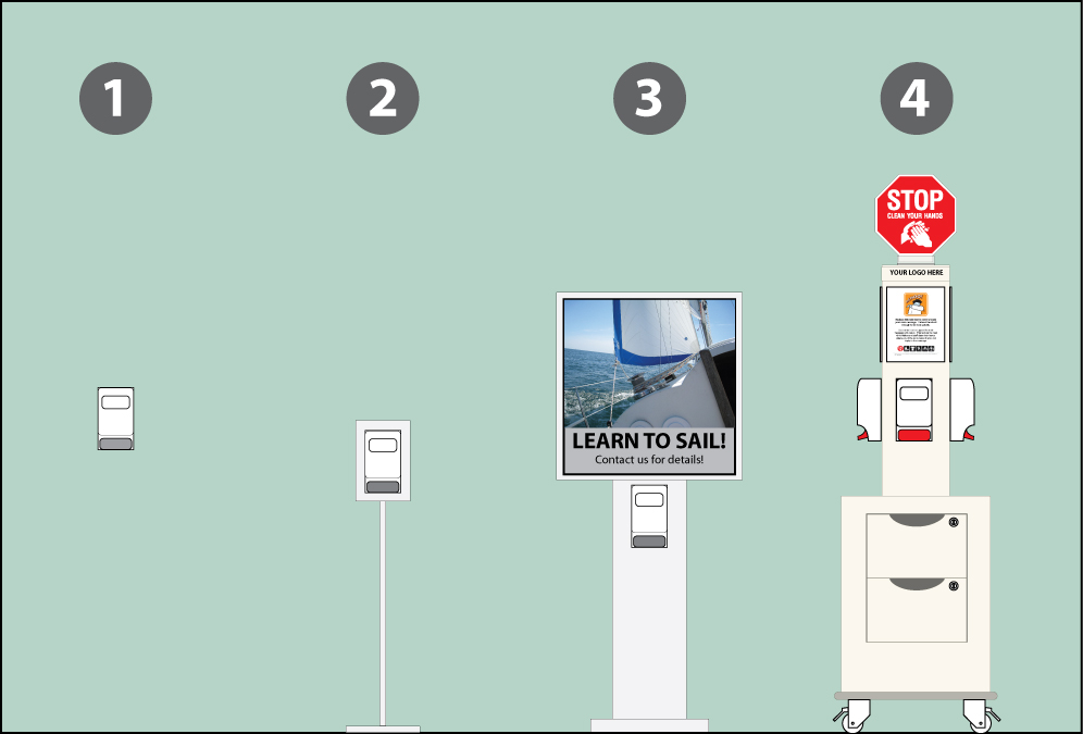
Here are a few of the biggest mistakes, illustrated using salt and pepper shakers.  Why shakers?  They’re common, rely on labeling to identify their contents and misuse can lead to error – potentially ruining a meal.  Nowhere near as dangerous as containing an outbreak, of course, but the similarities remain, making them an excellent analogy to play with.

SHAKERS1

First mistake:  Neglecting visual communications.

What do these contain?  Our assumptions lead us to table salt and ground black pepper.  But if we were Hungarian we would expect that one of these might contain paprika.  We don’t know so we make assumptions.  That’s the point – assumptions lead to risk. Read more ›

Posted in Healthcare Graphics Need Help

Healthcare Graphics Need Help: The Hospital Signage Gap

Sept 15 2014 blog title

It’s about time we got another installment of Healthcare Graphics Need Help out, so let’s jump right into things.  Above are two photos of typical hospital signage.  What about them? Read more ›

Posted in Healthcare Graphics Need Help

Why did we make the Infection Control Symbol Package?

Sept 11 2014 blog title

So…. why did we make the Infection Control Symbol Package?

Because there was nothing there. Read more ›

Posted in Articles

Healthcare Graphics Need Help: How To Do Colour Codes Right

Traffic Lights and Icons2

The infection control community loves colour codes.  Why shouldn’t they?  You can label a patient room with a blue sticker to show that the patient in there is currently under isolation for a gruesome antibiotic-resistant bug.  You can print out a standard hand hygiene notice to post on the entrance to a screening room, the pink photocopy paper it’s printed on communicating to cleaners to be extra careful when disinfecting. It’s quick and inexpensive, and to those in on the code it’s quite handy.

This is the main issue we have with them. Colour codes only work if everybody in that hospital is, in fact, in on the code – which of course is not the case.  Patients are not in on the code as they are, well, sick.  Visitors (who outnumber patients two to one on some days) are not in on the code either.  Housekeeping staff filling in at a different hospital or campus may not be in on the code as two hospitals are not guaranteed to use the same codes.  Hospital administration staff or contractors may not be in on the code either for many similar reasons, or they simply could be having a bad day and forgot.  These codes are therefore stunningly exclusive rather than inclusive. Read more ›

Posted in Healthcare Graphics Need Help

Healthcare Graphics Need Help – Looks Can Kill

As a saying, the phrase “if looks could kill” is usually used in the rhetorical sense.  Recently though there’s been some attention as to how this is, in fact, sometimes quite literally true.

Have you seen these?
Delicious Candy

If you haven’t, it might be hard to guess what they’re for.  Candy, perhaps? Read more ›

Posted in Healthcare Graphics Need Help

Healthcare Graphics Need Help – Minnesota?

In our last column, we took  a look at a variety of Hand Hygiene posters used by large health organizations, and what they could do to better communicate.  To summarize, the lesson we learned is that simply writing “hand hygiene” somewhere on them is not the same thing as them saying “hand hygiene,” and one tool that can fix that fairly quickly is to show action in the graphics – hands that are clearly shown in the action of cleaning themselves.

Then we posted this example:


mnhands

Apologies to Minnesota’s Department of Health if it seems that we’re picking on you.  This poster does get the action across well – this is clearly an illustration of a pair of soapy hands, showing the action of washing.  A running tap is even visible! Read more ›

Posted in Healthcare Graphics Need Help

New Guest Post – Hand Hygiene Needs its Golden Arches

500px-Star_of_life2.svg

We’ve been asked again to post at Deb Group’s Hand Hygiene Blog, where we continue from where we left off.  In our earlier guest post we talked about the benefits of getting the general public involved in infection prevention and explored a campaign model (fire prevention and safety) which has already been successful in doing so for a different area of public safety.

This time, we examine a tool which has been in use for thousands of years and the good that it could do for hand hygiene awareness.

Read it here!

Posted in Offsite Posts

Hey!

Hey!

Licensed for free use under a Creative Commons License. Click the image for the whole Infection Control Symbol Package! (opens in a new window)