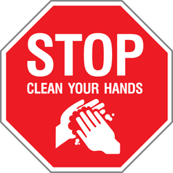
As far as public health is concerned, effective communications reduce panic, promote life-saving interventions and above all create order.
However, as evidenced by the fact we have a whole column on our blog entitled “Healthcare Graphics Need Help,” it’s very, very easy to make mistakes when it comes time to actually put those above ideas into use.
Here are a few of the biggest mistakes, illustrated using salt and pepper shakers. Why shakers? They’re common, rely on labeling to identify their contents and misuse can lead to error – potentially ruining a meal. Nowhere near as dangerous as containing an outbreak, of course, but the similarities remain, making them an excellent analogy to play with.
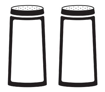
First mistake: Neglecting visual communications.
What do these contain? Our assumptions lead us to table salt and ground black pepper. But if we were Hungarian we would expect that one of these might contain paprika. We don’t know so we make assumptions. That’s the point – assumptions lead to risk.
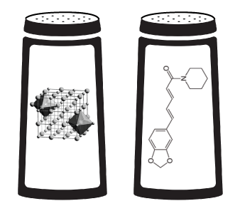
Second mistake: Overestimating your audience.
Or alternatively, underestimating the size and breadth of your audience. We aren’t all analytical chemists – plain language leaves nobody behind.
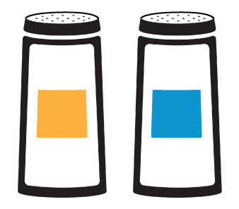
Third mistake: Being cryptic.
We’ve written about using colour codes before – the short answer is don’t, unless it’s self-evident what the colours mean.
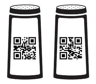
Fourth mistake: Using tech for the sake of it.
Just because tech is sexy doesn’t mean it’s effective. The labeling is unreadable to most of the population – even when the QR codes are working perfectly.
Next time you see a piece of health communications, think for a second about the shakers. Do any of the above mistakes get in the way of the communication being effective? Make people neither want to read it or understand it? Delay action while struggling to convey its message?
Or does it turn an ambiguous situation into one of situational understanding and proper, orderly use of available resources?
Keeping public order is one of the most important tasks when dealing with any public health issue – and let’s face it, the world is attempting to deal with several as we write this. You have to admit that if a salt shaker contained Ebola virus, you’d certainly want to be sure that it was labeled as clearly as possible – not just for you, but for the entire population. We need order. Now.
[…] these need to be in sync – such a protocol needs to ensure that everything is up to spec and nothing falls behind. This is how road safety does it, and it’s worked out pretty well so […]