Visual communication is difficult, especially if you aren’t steeped in it every day like we are. So difficult in fact that once again we’re using a communication from the venerable Centers for Disease Control:
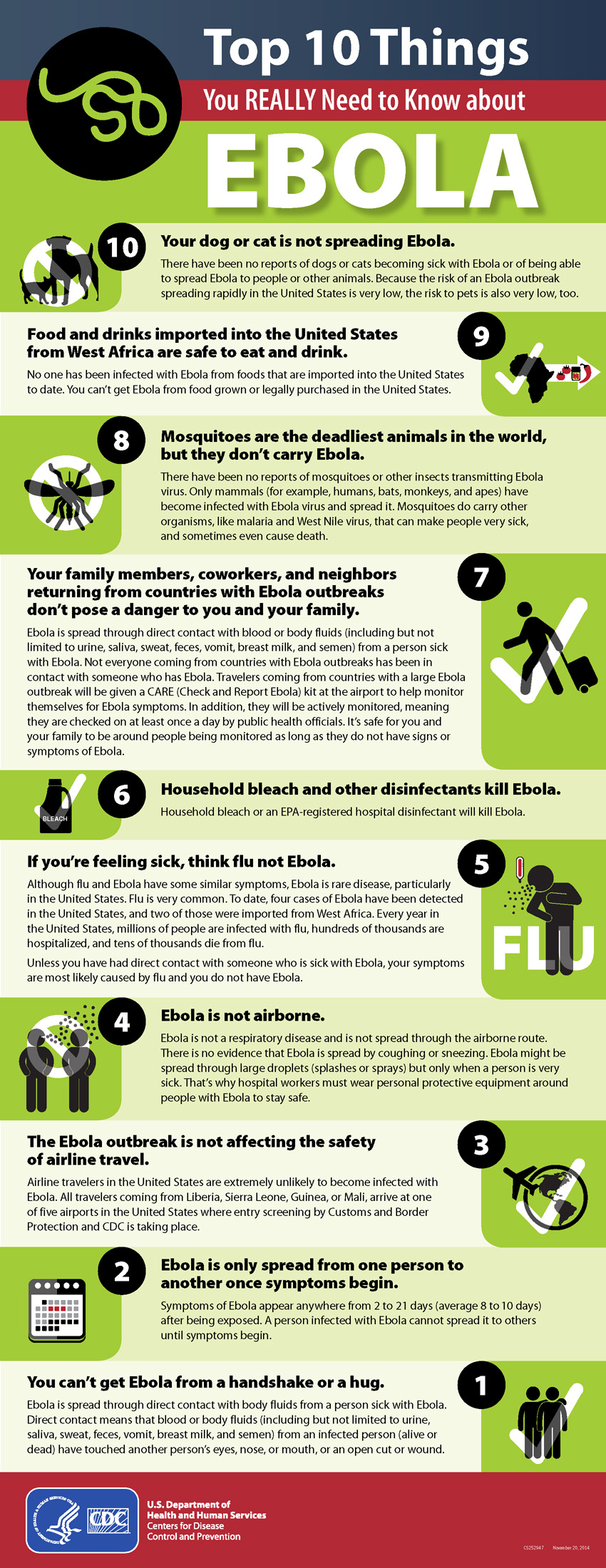
Today we’re talking about communicating through symbols and the importance of matching your visuals with your message – which this poster does not do. Now, that’s not to say that the information in the poster is bad. The content itself is good and very important to share if a bit wordy, but even the best campaigns can get derailed by poor visuals.
Firstly, what’s meant by the first symbol (#10)? If you don’t read the text, it’s “dogs and cats not allowed,” right? It’s by far the most common use of pets within a circle with a diagonal line.

But that’s not what the poster means. The poster means “Your dog or cat is not spreading Ebola.” Okay, so they’ve decided on using unconventional symbology. They must have a good reason for it. After all, the “no mosquitoes” symbol as used in the poster apparently means that the insects don’t transmit the disease either.
But if that were the case, why switch to check marks for half of the examples? Why do some checks mean that an activity is safe (hugging, importing, traveling), while one is about the safety of airline travel (which seems redundant given #7) and one is about the clinical effectiveness of bleach?
This may sound small, like we’re nitpicking, but it’s not. In public health communications misinterpretations can be costly and dangerous. This poster is not the most visually confusing we’ve seen from a public health organization or even the CDC, but it’s fairly representative of the genre.
If a message gets muddled and confused before it even leaves its poster, it’s like a game of broken telephone and whatever good the original message had is very likely to be lost. This defeats the purpose of communicating.
Posters, signs and other visual health communications have never been more important than they are today. They have a need to get their point across both quickly and accurately. Symbols can accomplish this well if they are respected, used consistently and speak the visual language of those being communicated to.
Leave a Reply