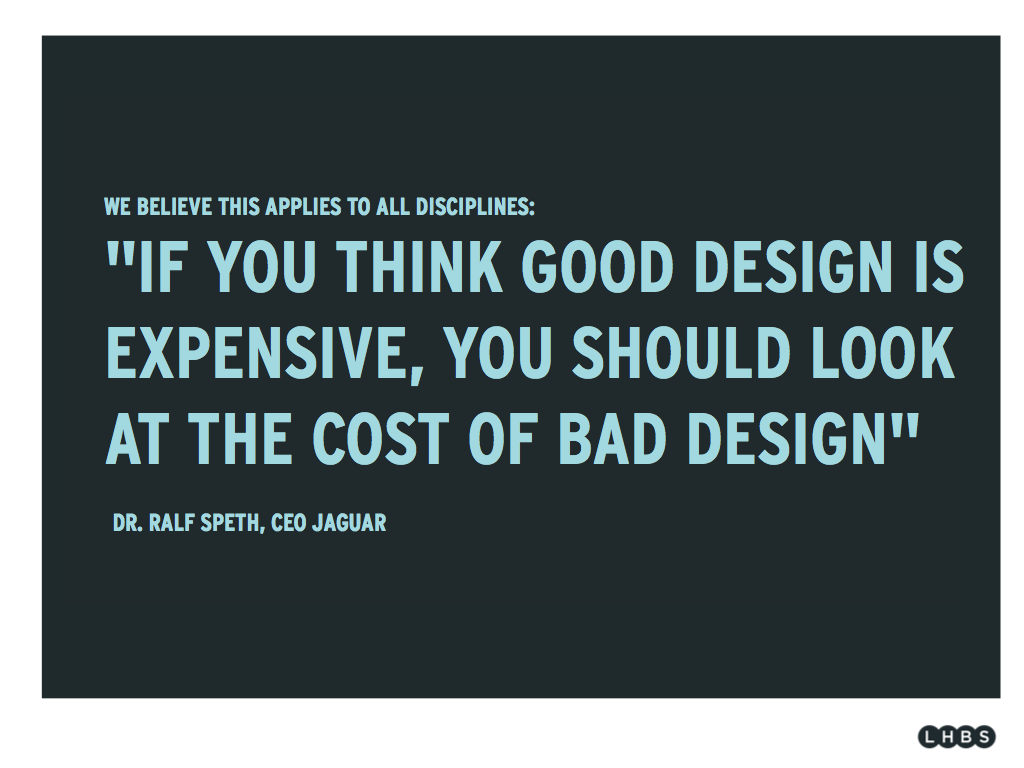
There are many things in this world that seem simple and understandable to the layperson, only to reveal their complexity and depth when studied on a more professional level.
You know a cold when you have one, and to most people that’s enough – a cold is a cold and you spend a few days in bed with a warm cup-o-soup. To a doctor, your cold isn’t just a cold. It’s probably one of a large family of rhinoviruses, each with their own particular effects – a distinction that many consider academic at best, like telling the difference between wasps and bees. It could also be a case of influenza, which shares certain symptoms and matters a lot more, especially to the young or elderly.
Visual design is another field that is deeper than many give it credit for.
To most people, design is invisible. This is because a good design doesn’t draw attention to itself, it draws attention to the message. Unfortunately because many don’t see the design, they come to the conclusion that it must not matter. But it certainly does! How?
1. It affects how people see and value the brand. By brand, we mean the knee-jerk reactions that people get when they look at a piece of design, which is controlled through everything from font choice to colour scheme to layout. Does your product or campaign seem trustworthy, healthy and modern or cheap, haphazard and stodgy? That’s up to the design!
2. It affects the timing of the message. It’s about making sure that people read and understand it at the right time through message placement, repetition and accompanying visuals. You don’t want people missing an emergency exit sign during a fire!
3. It affects understanding of the message’s context. When you go to lighten a dark room, you glance (or feel!) for a light switch. What if that switch did nothing? Or turned on a loud sound system? Firstly you’d be confused, secondly annoyed. By designing with context in mind you can guide people to perform the correct action and avoid mistakes and errors.
So, would you be happy with design that people think makes you look cheap, that doesn’t get read on time and when it does it leads people to the wrong conclusion? Or do you want professionally-crafted, concise messages that are read when they need to be and that strengthen the brand of your organization?
In healthcare, messages tend to be life-concerning. If messages of (say) hand hygiene are not trusted, understood or on time the consequences could be dire indeed. Lives could be lost, and that’s no hyperbole.
This is why design matters.


[…] stations are not valuable because they are a nice piece of furniture, but because they are the physical embodiment of the public-facing, multi-modal hand hygiene program itself. This means they draw, invite and […]